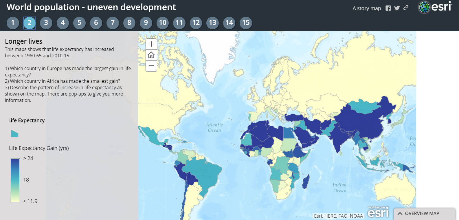
World Population Trends is an interactive story map series produced on the ESRI platform. Fifteen maps in the series show patterns of change in the world’s population from 1960 through 2015. The maps in the series represent population changes due to birth and death rate changes, life expectancy changes, fertility rate changes, and changes in migration.
Applications for Education
World Population Trends includes guiding questions on many of the maps in the series. The questions ask students to evaluate the data in front of them to determine the answers to the questions. For example, the sixth map in the series asks, “What similarities and differences are there between the map for crude birth rates (Map 5) and this map of death rates?”
H/T to Maps Mania.