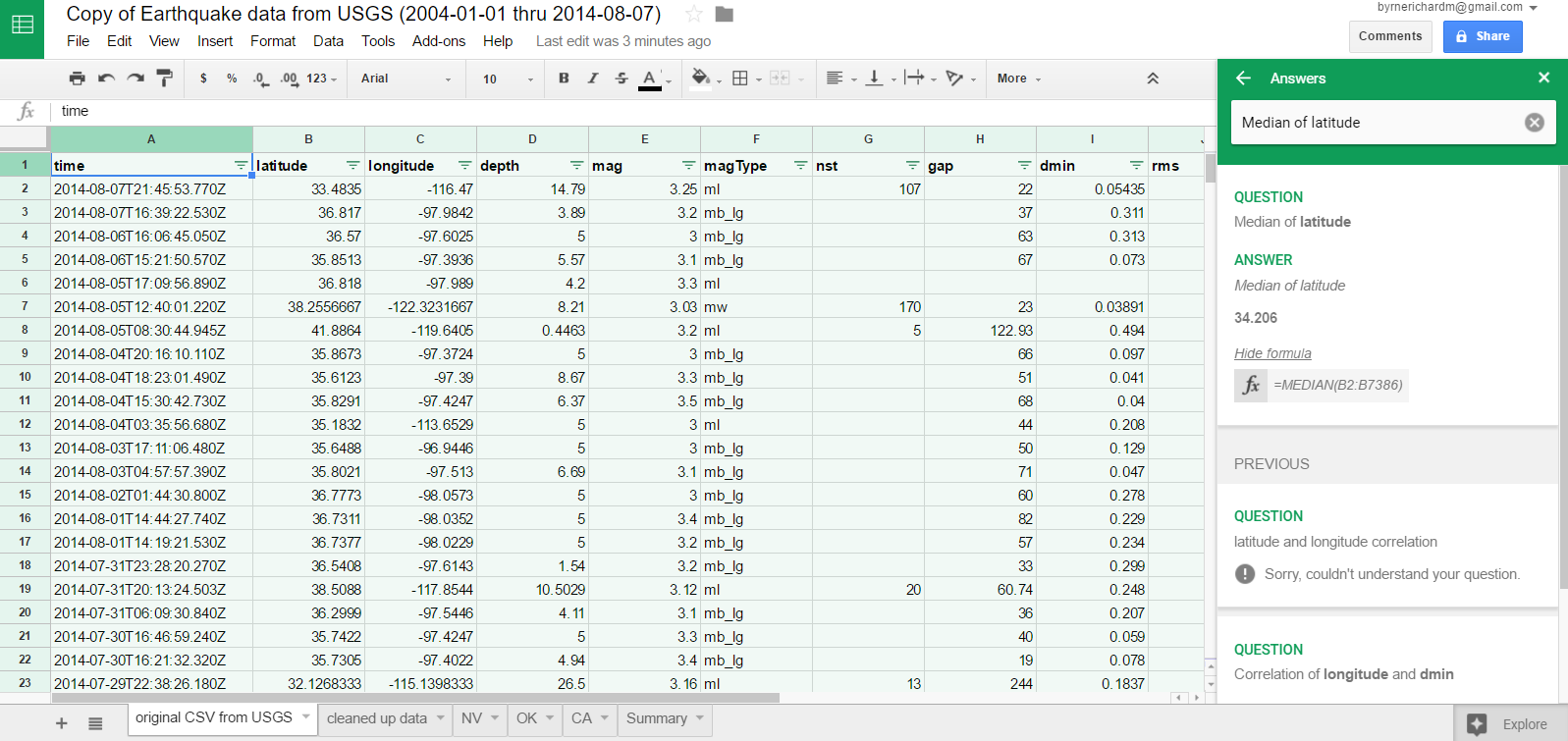
Interpreting data from a spreadsheet can feel a bit overwhelming to a lot of students. That’s why I’m excited about Google’s latest update to Google Sheets.
Last week Google added a new feature to make data visualization and interpretation easier than ever. Now when you open the Explore feature in Google Sheets you can simply type in a request for a chart to be displayed based on the data in the sheet. You can also make a simple request for something like the mean or median value of a column.
Applications for Education
I often point out in my search strategies webinars that just because spreadsheet data can be hard to interpret that doesn’t mean that students should avoid it. Spreadsheet data can give students some valuable insights if they can get to the bottom of it. These new Google Sheets options can help students get a better understanding of the data contained in spreadsheets.