Last night on the Practical Ed Tech Facebook page I shared a post from Randy Krum that included a visualization of U.S. population growth. Watching that visualization led me to a related visualization about world population growth.
World Population History is an interactive map and timeline of the world’s population growth from 1 C.E. to today. The map is essentially a heat map of population centers. The timeline at the bottom of the map features little placemarks that feature developments in science, trade, and major political events. Students can click on the markers in the timeline to learn more about each development.
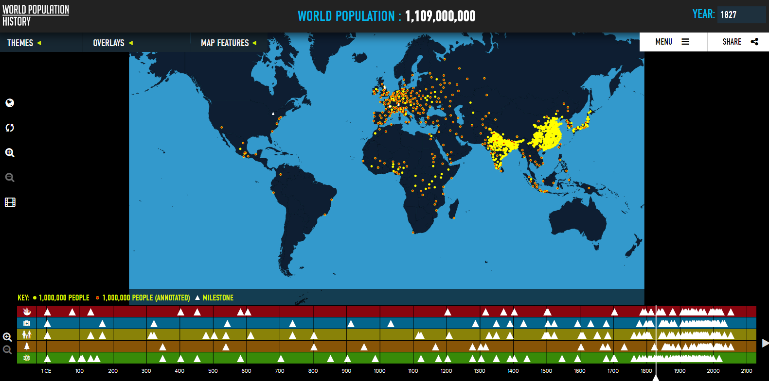
Applications for Education
The combination of the map with the timeline can help students see the correlation between scientific advancements and changes in population growth. For a classroom activity you could have students create a similar map and timeline of population changes in their local areas. For example, my students in Maine might make a map and timeline that depicts changes in forestry practices and the corresponding changes in populations throughout the state.